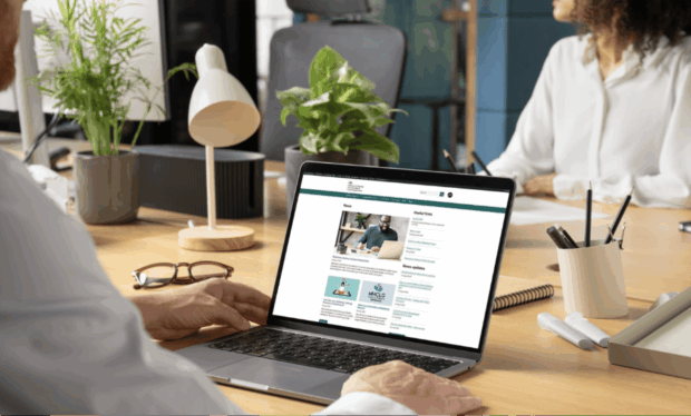
At MHCLG, colleagues across the UK use the intranet daily for news, resources and guidance, such as HR or IT policies, and to access internal digital services. My first project on joining the department as a senior content designer in the Publishing team, was to produce a content audit of the existing intranet and make improvements based on the findings.
This work supports our digital strategy objective to enhance operational excellence and drive organisational efficiency, helping colleagues to self-serve better by making internal digital services easier to use. It’s also part of the MHCLG Disability Action Plan – an internal policy focused on creating an inclusive working environment where all colleagues feel valued.
Phase 1: Doing a content audit
Our intranet is built on WordPress and had more than 5,000 live pages at the start of the audit. Impressions were mixed, with users struggling to find and use information. The search bar was inconsistent, and content was cluttered, presenting an opportunity to introduce good content governance. However, colleagues did consider the intranet a valuable resource they needed at work.
The goal was to make it usable and accessible for everyone.
During the audit, we analysed:
- page types (such as guidance, news stories and blog posts)
- number of pages
- number of page views
- user search terms
- time spent on a page
- readability grade (in line with the Hemingway App)
- document accessibility, including PDFs, Word documents and PowerPoint decks
- the extent to which the content met the Web Content Accessibility Guidelines or the government Service Standard
We noticed that some pages were out of date, duplicated, orphaned or not fully accessible.
After an initial cull of pages that were redundant, we used analytics and WordPress metrics to identify the 100 most popular pages on the site. Our small team of content designers rewrote them to introduce a consistent structure, style and tone.
As Lizzie Bruce writes in her book 'Task-based intranet content', “Generally, people want information about a specific thing, fast, when they visit the intranet. They need it in as little time as possible, so they can get on with their job, or enjoy their lunch break”.
With this in mind, we made content concise and easy to digest, and used keywords (in the front-end and back-end) to make information easier to find. We also removed more than 500 PDFs to improve accessibility – some of them were out of date so we simply removed them, others were transformed into clear and accessible HTML pages.
We worked extensively with subject matter experts, including Human Resources Policy, to make sure content was accurate. Pages often linked off to others with duplicated content, which ultimately expanded the scope of our initial review.
Phase 2: Introducing content structure and improved governance
In this phase, we worked with a user researcher to better define our user types. This was not a simple task, as the intranet is a central source used department wide.
Eventually, we narrowed it down to the following 3 user groups:
- general user – completes work tasks, wide range of roles, may also be a line manager
- human resources and trade union user – creates and uses department policy
- editor user – creates, edits and publishes, has full back-end access
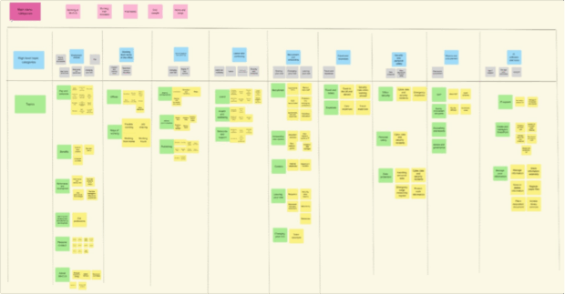
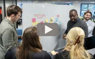
We made sure to recruit a diverse mix of users to represent our colleagues across different teams and roles. This included people with disabilities and neurodivergent needs. We gathered regular feedback in surveys and through usability sessions, where we used tree testing to examine different content structures. We built interactive wireframes to resemble a live site and encouraged users to complete tasks so we could monitor pain points, likes, dislikes and what users needed from an intranet.
We also reached out to other government departments for demos and insights on intranet design decisions. This included the Department for Education (DfE), UK Health Security Agency (UKHSA), Ministry of Justice (MoJ) and Department for Business and Trade (DBT) – thanks again to those who were involved!
Futureproofing the intranet publishing process
The intranet had over 600 authors with full access to edit, delete and publish content. Some users had published hundreds of pages, while others only 1 or 2 – all different styles, quality and accuracy.
To futureproof it, we (the Publishing team) decided to centrally own the site and limit authors. The internal communications team continued to manage news stories and blogs. We introduced best practice guidance and a new governance process for all editors to follow, including a 2i review, accessibility checks, archiving policy and maintenance plan.
Where information already exists, we link to it, not duplicate it. The content on the intranet is task-based and written in plain English where possible. Content is useful, informative and consistent to help people complete tasks easily.
It goes without saying, as a digitally-minded team, we’re also focused on artificial intelligence (AI) and how we can use this technology on the intranet. However, the effectiveness of AI tools depends on the quality of the data they draw and interpret from – making it even more important that our intranet content is clear and structured correctly, with meaningful metadata.
Phase 3: Designing a CMS inspired by GDS
Throughout this project, we adopted many of the Government Design Principles into our work. Mainly, using user needs and colleague feedback to inform design decisions. But another area we wanted to explore was the design and components.
WordPress as a platform is easy to use but certainly comes with its limitations. In our clunky, old version of the content management system (CMS), we couldn’t use components compliant with the GOV.UK Design System. And with so much research already done by the Government Digital Service (GDS), we utilised the GOV.UK Design System for inspiration on style, components and patterns when building our new CMS.
We also worked with our technology colleagues to introduce improved security features and robust authentication settings for better access control, making the intranet more secure.
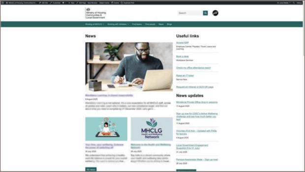
A modern, sharper, user-first platform
Colleagues can now enjoy:
- a look and feel consistent with GOV.UK patterns for a better user experience
- components that follow the GOV.UK Design System and have been tested for accessibility
- better navigation, including a single-entry menu at the top of the page
- an improved search functionality, with new filter options
- subscribing to authors, blogs and news stories, with notifications when anything new is published
- a fully tested intranet site with improved accessibility
- a more secure intranet with authentication settings
The intranet project exemplifies how digital, user-centred approaches drive organisational efficiency. This new, smarter workspace will support collaboration across our workforce, saving time and resources, so that our colleagues can focus on the work that matters. It is also a solid foundation for continuous improvement from smarter intranet features such as the integration of AI tools, to better ways of measuring productivity impact to ensure lasting efficiency gains.
Contact intranetpublishingteam@communities.gov.uk to find out more about the work of the Publishing team or if you would like to learn about how our expertise can help you with your own projects.


2 comments
Comment by Kate Fenton posted on
Really interesting article. I'm interested in your content categories in Mural but it's difficult to read the text in the image even at higher zoom levels. Have you got a higher quality image?
Comment by Sian Goodwin posted on
Hi Kate, glad to hear you found the article interesting! A Mural image is included for illustrative purposes of the design process, and details are blurred to protect internal data. If you’d like to discuss or learn more about the project, feel free to contact our publishing team.