At the Department for Levelling Up, Housing and Communities (DLUHC) one of our core roles is to award funding to organisations who do the detailed delivery work to achieve policy objectives. For example, the Towns fund delivers £3.6 billion to 100 towns to drive regeneration.
There are many separate funds and at the moment each fund has its own process and application form. The process is designed to make sure that funds are properly accounted for, but historically it hasn’t been designed to meet other needs of applicants or those administering the system. As a result, the funding prospectuses and application forms can:
- be difficult to navigate
- use inconsistent language from fund to fund
- be difficult to apply for and administrate
- make it more challenging to deliver effective outcomes
The funding service design team has a big vision: to transform the way DLUHC delivers funding. The aim of this is not only to improve the user experience, but also to:
- reduce the burden of administering funding
- improve the effectiveness of funding delivery
One of the unintended consequences of a big vision can be that it feels abstract. The very people we’re trying to help can hear it and still think “what does that mean for me?”
Digital transformation is intangible: you cannot hold the internet in the palm of your hand. It can be difficult to explain to someone what that signifies in a way that they can imagine.
We needed to:
- find a way to bring everything together, whilst still focusing on the user
- describe the experience we want our users to have when they interact with our service
- tell the story of our vision in a way that had meaning for digital and non-digital team members.
A user centred vision
Within DLUHC, we work as a digital team to apply the service standard to funding design and delivery. We’re designers working in a digital world: when we see a problem, our mind turns immediately to how to solve it.
It’s easy to think that a solution means a product or tool, but this can limit our thinking. Solving big problems means that your approach needs to reflect the scale of the problem. That led to approaching our vision in a way that put our users at the centre.
Building around the user’s experience creates a standard. It's something for us all to work towards, no matter what we do.

What did we do?
As we moved from alpha to beta, the team grew. With so many new faces, it was important that all the members of our team could understand what we were trying to do in a tangible way.
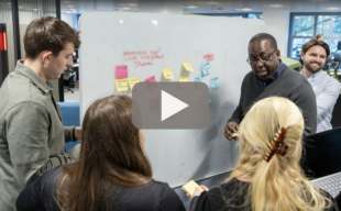
We learnt a lot about our users and their needs during our alpha. This gave us a good place to start. We ran a workshop to get everyone in the team to think about:
- what we already know about our users
- what our users are trying to achieve
- what the obstacles are that stop them from achieving their goals
- what frustrates our users
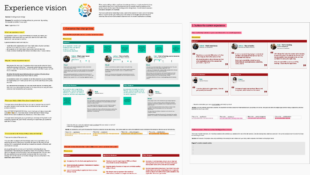
During the workshop, we built up a picture of our users' current experience. The team began to empathise with the users in a way they had not been able to before.
Next, we focused on what that experience could be if the obstacles disappeared. The story began to tell itself, and with a little content design, we had a collection of stories. Each of those stories centres around the experience one of our users will have.
How are we using it?
A single tool or product is not going to achieve this vision. The vision is what unites all the different activities we undertake as a team. It gives us the opportunity to solve problems holistically. It may take time to realise, but now the team is clear on what we’re aiming for.
The stories we've created give us something to measure against. We can measure every solution we design by how much closer it gets us to our ideal. This is the same user experience strategy Apple used in 1987 when they created the knowledge navigator. They realised this more than two decades later when they launched the iPad. We can use our vision to decide value and prioritise tasks.
Our user-centred vision is not a one-off workshop for us to do and forget about. It’s a living artefact that evolves with us as a team as our understanding of funding service design grows. The team has already begun to see the impact of user centred design in practice. Over the last few months, the team have already:
- refined the guidance for the Community Ownership Fund prospectus to be more accessible.
- automated processes to make administering funds more efficient for the Levelling up Fund.
- established and baselined a set of user centred measures, to monitor and improve the performance of our service against.


