The Funding Service helps grant teams deliver funding quickly and consistently to local councils and communities, saving time and money. As a multi-disciplinary team within the Ministry of Housing, Communities and Local Government (MHCLG), we provide digital and specialist support from the design and launch of grants through to delivery, working closely with policy teams to ensure our users are at the heart of everything we do.
In this blog post, find out how we transformed a complex monitoring spreadsheet into a user-friendly digital form, helping both local authorities and policy colleagues in MHCLG.
Picture this:
You’re a local authority who receives funding to deliver specific outputs and outcomes.
You know you need to report these outputs and outcomes back to the government as part of monitoring and evaluation.
You’ve collected all the data you know you’ll need.
It’s time to report on your progress and you’re given a complex, multi-tab spreadsheet to complete and a separate guidance document to navigate.
Aims
As a content designer within the Funding Service, my goal was to transform a monitoring spreadsheet for the Community Cohesion and Resilience Programme (CCRP) so that we could:
- reduce the monitoring burden for local authorities by simplifying the way they report data to MHCLG
- make sure that the user journey is intuitive and consistent for all reporting periods
- remove any jargon and make all content easy to understand in both the form and any guidance
- improve the quality of data we collect and ensure it aligns with our data standards
As part of our mission to help simplify the funding landscape for local authorities and reduce unnecessary monitoring burden, monitoring activities are done through our Delta platform. This means that all grant recipients submitting monitoring data to MHCLG can expect a consistent user journey and experience.
Read more about how we transformed Delta based on user needs.
Opportunities for improvement
When reviewing the original spreadsheet, I approached it from the perspective of 2 different users:
- a local authority who had to complete the form
- the policy team who would analyse the collected data
I identified several opportunities to make improvements for each user group, based on some pain points identified:
Local authorities:
- Some questions had word limits, but the spreadsheet did not allow users to check word counts easily – to do this, they would have to use Word and copy and paste it into the spreadsheet or, if not, they could exceed the limit unknowingly.
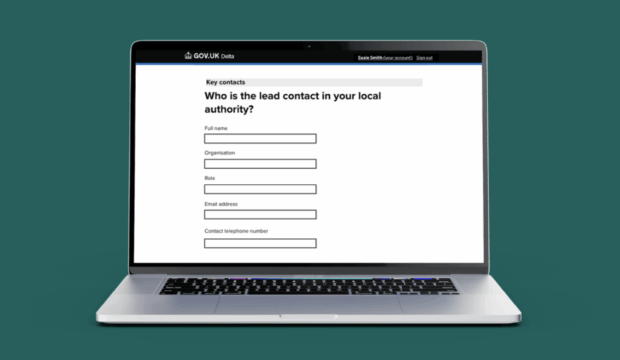
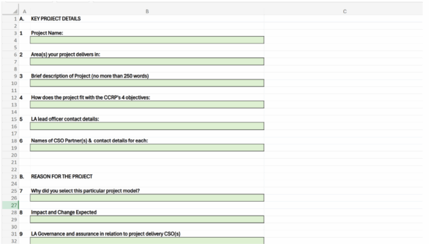
- Some questions were unclear (screenshot showing examples of questions below) – for example:
- ‘Contact details’ does not specify exactly what information is required, such as email address or telephone number.
- ‘Area(s) your project delivers in’ lacks specificity – should users enter town, city, county or country names?
- Guidance on how to complete the spreadsheet was on a separate document, so users had to switch between multiple documents (screenshot showing an example of guidance below).
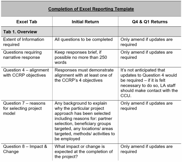
- The guidance included some, but not all, questions, so users would have to check which questions had extra guidelines that they needed to follow.
- The spreadsheet and guidance documents were not accessible for all users, for example screen reader users may find it difficult to use both documents concurrently, or people with physical or motor disabilities may find the spreadsheet difficult to navigate.
The policy team:
- The data collected would be poor quality as there were no validations to ensure that the data was consistent and standardised.
- Any missing data may need to be followed up manually with each local authority, adding administrative burden.
- The data could not be compared across local authorities easily, and the team would need to analyse each tab separately.
My approach
I tackled this project by:
- Using prototypes to increase collaboration across multi-disciplinary teams in the Funding Service and the policy team
- Transforming the content so it’s user-friendly while meeting data standards
Using prototypes
This project required collaborative working with multidisciplinary teams, including the policy team, the form developer and an interaction designer.
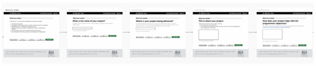
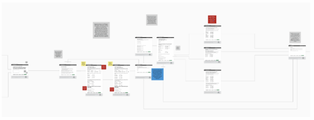
To streamline the review and editing process and reduce the need for back and forth, I created a prototype of the form. This allowed everyone to visualise what the end product would look like and proved very effective, enabling everyone to collaborate in one place and add ideas directly into the questions within the form.
These screenshots show examples of the prototype I created. The prototype clearly shows the user journey through the form, displaying questions, hint text and answer fields. This fostered a collaborative working environment between teams as it allowed them to comment and ask questions directly on the design of the form.
Prototyping was also helpful to display more complicated journeys, for example forms which used conditional logic, as shown in the image below. Guidance and a key were added to help colleagues use the prototype.
Transforming the content
Designing content for this form was a challenge. I always tried to look at it from local authority users' perspective and visualise the easiest way for them to complete it. This meant:
- only showing questions that were relevant to them
- providing content or guidance only when needed
- drafting clear and concise questions
- making answer fields more specific and consistent
Adding conditional logic to the form
In the original spreadsheet, it wasn’t clear which questions and sections were relevant for each local authority. Users might struggle to know which tabs or columns they should complete, potentially resulting in incomplete submissions.
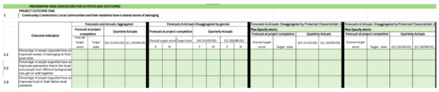
The screenshot below shows an example of several data categories that the policy team were asking for: aggregated, disaggregated by gender, disaggregated by protected characteristic 1, disaggregated by protected characteristic 2, and so on.
What isn’t clear is whether all local authorities had to complete each section, or which ones were relevant to them.
To simplify this, we added a question into the form so that the journey could be tailored for each local authority and would show only questions that were relevant to them. For example, the screenshot below shows how we added a question about the key protected characteristics (aligned with the key characteristics published on GOV.UK) that were relevant to their project:
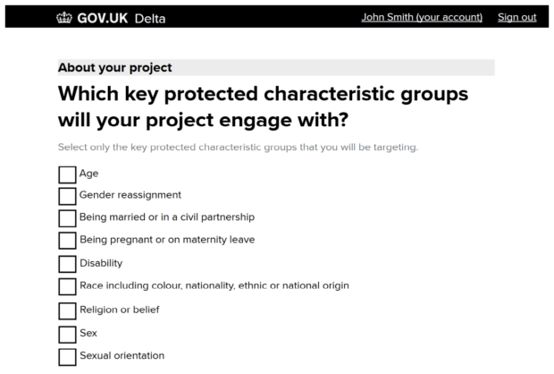
Subsequent questions would then be tailored to show only what they selected, removing unnecessary burden by incorporating conditional logic into the form.
Removing confusing guidance by adding hint text
While guidance can support users completing forms, it needs to come at the right time and in an easily digestible format. Previously, a separate guidance document was sent to local authorities, who would have had to read it in tandem with completing the spreadsheet.
To simplify the process, I added hint text directly to the relevant question in the form, where needed. This allowed users to stay in one place when filling in the form, without needing to refer to another document.
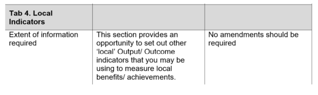
The screenshot below shows the previous guidance about how to complete one of the tabs for other local outcomes and outputs:
In the previous journey, users would:
- Navigate to the tab in the spreadsheet
- Find the relevant part of the guidance relating to that question and tab
- Determine whether they needed to complete the column or not
- Return to the spreadsheet and complete the columns if necessary
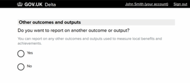
To simplify this, we added a question to ask whether they wanted to report on another outcome or output, using active language with hint text as a prompt.
Users simply answered 'yes' or 'no', which would then take them to relevant follow-up questions based on their response. This screenshot shows the final question in the form:
Using clearly defined fields
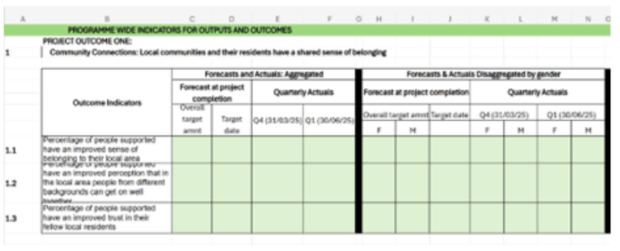
The screenshot below shows the original spreadsheet format, which wasn’t accessible nor particularly user-friendly. It was also unclear exactly what format local authorities should submit the data in, for example:
- Should the date be DD/MM/YYYY (03/03/2025) or Day Month Year (3 March 2025), or another format?
- Should users be adding ‘%’ to forecasts and actuals?
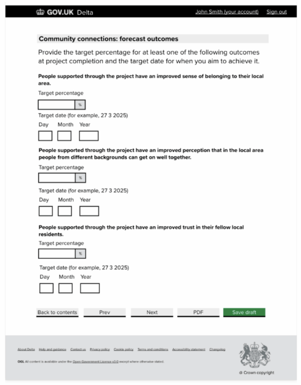
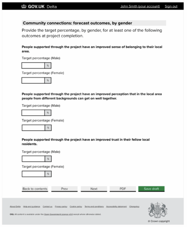
To improve the content, I transformed the layout and followed GOV.UK design components where possible. This provided users with components they may have seen across other digital government services (for example, date input) so their experience was consistent and easier to follow.
We also added validations to prevent data errors, such as making sure that percentages totalled 100%. This helped to improve the quality of data we received.
The result
By thinking about our users and their needs, we were able to transform the spreadsheet into a more user-friendly form.
The benefits for users are:
- improved user journey, making it easier to complete the form
- clearer questions and guidance to support them
- more consistent experience with other government services and forms from MHCLG
- better quality data received from grant recipients, which allows for detailed analyses
We also received some positive feedback from the policy team:
“By working with the Funding Service we were able to access invaluable expertise that resulted in a much-improved online monitoring product that benefits the local authorities we work with and provides us with better-quality data.”
Get involved
We’re always looking for ways that we can improve our service and make things easier for our users. This includes conducting user research and testing to ensure our service is user-friendly and accessible for everyone.
If you’d like to get involved in user research or testing, or hear more about our work, you can:
- email us at FundingService@communities.gov.uk
- join the #content Slack channel on UK Government Digital, if you work in government


Recent Comments